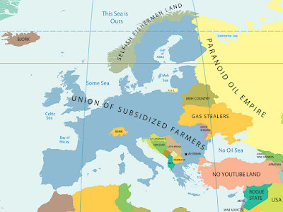
I thought this map was pretty cool. (But also very nerdy)

A map showing how crazy our country is for baseball

Map says it all.

A map showing GDP differences in the world. Apparently, America, Europe, and Eastern Asia is fattened up and living in excess. Mexico seems to be a good balance...

Cool design.


0 comments:
Post a Comment